AIGA Census Data Vis
Web Design, Data Vis
A reflective digital experience visualizing the challenges designers face
Through the 2019 AIGA Census data, 9,429 designers participated in informing what is currently going on in the design field during 2019. The interactions encourage users to share their own concerns in their work and allows for a collaborative "posting board" for designers to empathize with, share resources, and learn that the problems they face are shared by their peers: we, designers, are in it together.
Through the 2019 AIGA Census data, 9,429 designers participated in informing what is currently going on in the design field during 2019. The interactions encourage users to share their own concerns in their work and allows for a collaborative "posting board" for designers to empathize with, share resources, and learn that the problems they face are shared by their peers: we, designers, are in it together.
Collaborators
Jina Lee
Raymond Pai
Jina Lee
Raymond Pai
Duration
7 weeks
7 weeks
Tools
Figma
HTML/CSS/JS
Cinema 4D
Figma
HTML/CSS/JS
Cinema 4D
Problem space
How might we explain the misconceptions about design challenges through data based on the type of industry they are in?
Our end concept was to use data that helped reflect the challenges that designers currently face and the assumptions that come with them. This decision was made so that users can see this data to evoke empathy and understand that they are not alone in the problems that they face with their work
Our end concept was to use data that helped reflect the challenges that designers currently face and the assumptions that come with them. This decision was made so that users can see this data to evoke empathy and understand that they are not alone in the problems that they face with their work
Website
Feature 01
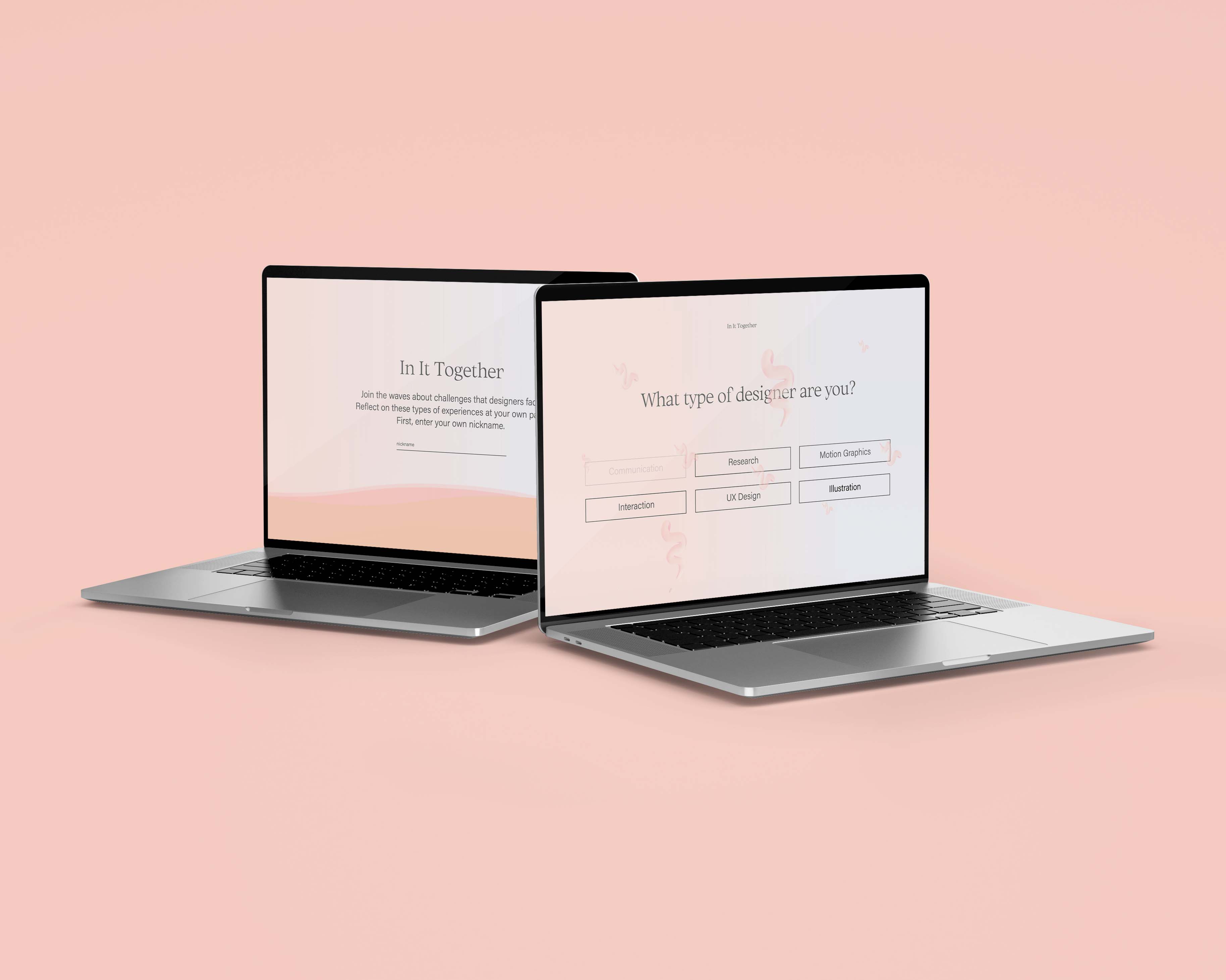
Login page
Users are asked to first add their nickname into the visualization to bring about a more comfortable and personal experience.

Feature 02
Pick your field
Users are able to choose what type of design they are. Hovering over the type of designers, lets the user see different symbols. This introduction is meant to get a better idea of where in the data this user is corelated to.

Feature 03
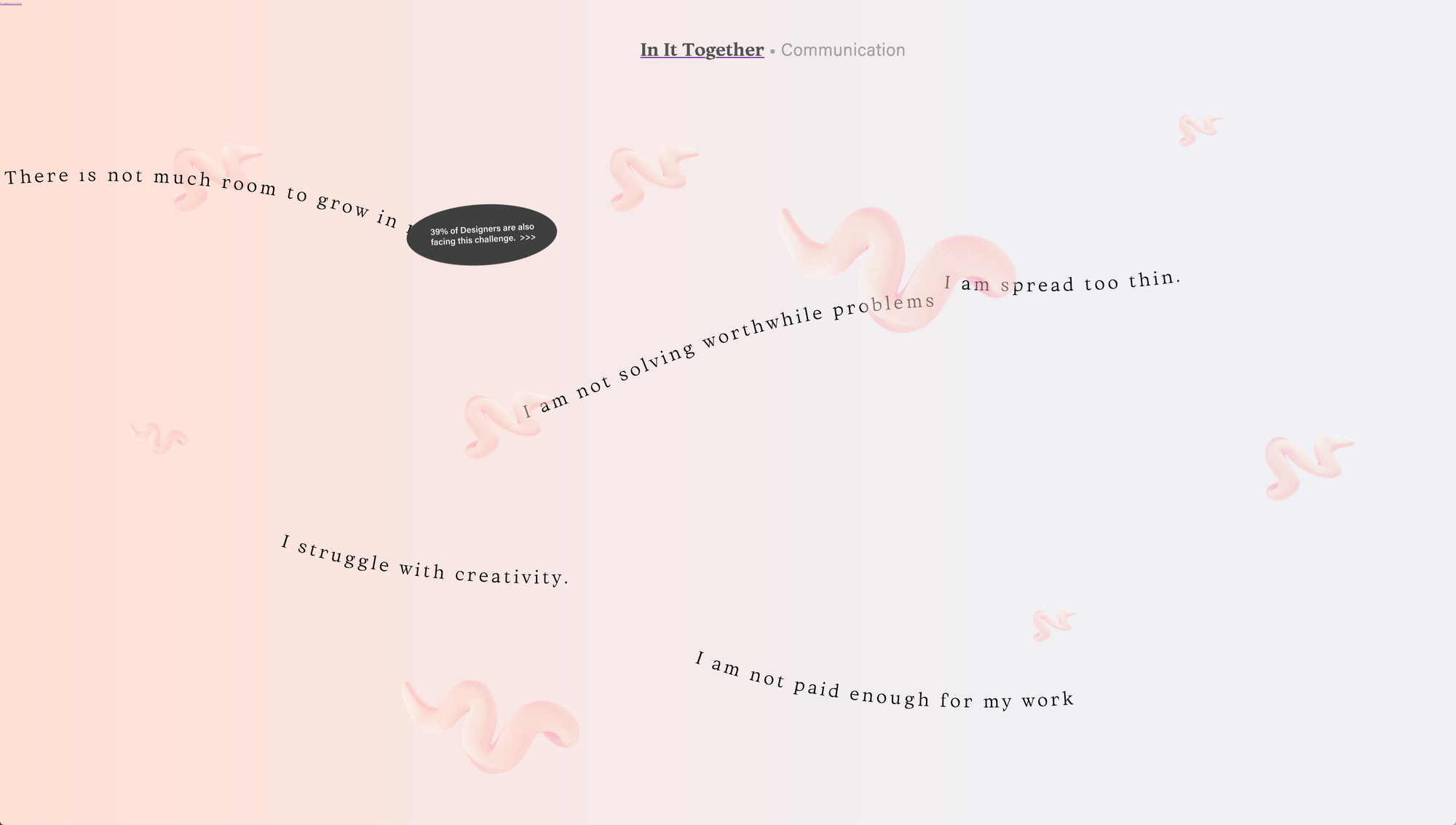
Interactive waves
Once the type of designer is chosen, then the users are able to get the top five waves of challenges. Each type of designer has the waves differently! This visual interaction of the waves allows users to get a subtle glimpse of the data. When hovering over a wave, users are given a sticker that explains more about how many designers in their fields agree with them.

Feature 04
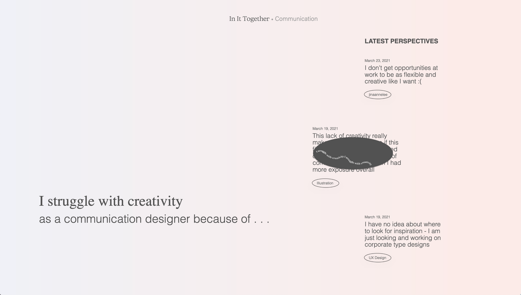
Reflection of your perspective
If there is a challenge that resonates with a designer, then they are able to click on it and have a reflective piece. Then after submitting their reflection, then users will be able to see other perspectives that other designers added.

Design System
The main visual focuses on using waves as a metaphor to reflect how designers feel about the challenges they currently face and give them a space to reflect and form agency over their struggles. The design system was thought out to use warm beach tones to evoke comfort in the users. In addition, the serif brings about a sophisticated mood which works well with simple interactions and white space.

Research
For a more indepth process documentation
Click to view our notion
Click to view our notion
Reflection
Web has its own affordances that should be emphasized. Because coding was new, it was challenging at first to get everything working. However, after watching multiple tutorials and reading posts about others experience with coding, it was much easier and now something that I am much more confident in.
The storytelling of data is important so that users are able to easily identify and understand. It is important to thoroughly understand the data first so that you are able to explain in in a much more unique manner.
Content is crucial in influencing an experience in the sense that you need to focus on the hierarchy so that the interactions don’t get lost. Never add elements because you just want to fill up the page. Simplicity is not a bad thing and should not be something that you are afraid of.